The DFR table
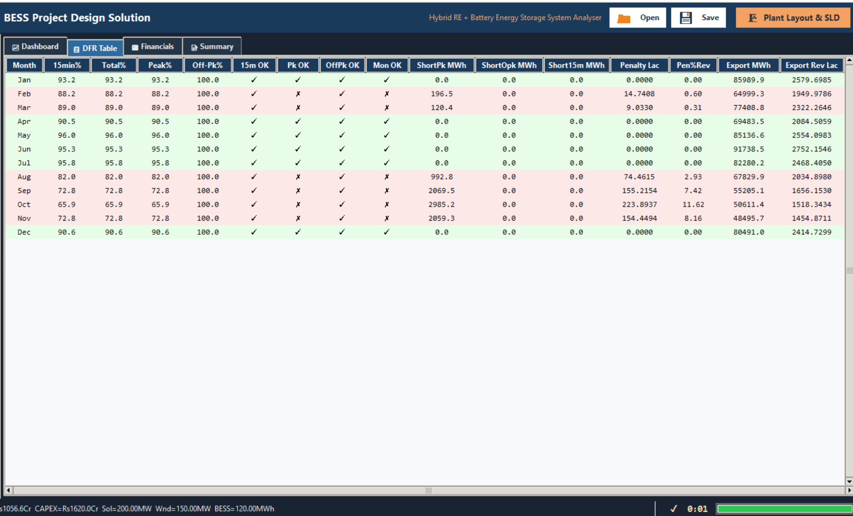
The DFR Table tab's column groups — delivery, met/missed, shortfalls, penalty and export — and its green/red row shading.
The 📋 DFR Table tab reports one row per calendar month of Year 1, once a run finishes. Each row carries that month's Delivery Fulfilment Ratio (DFR) at every granularity the application tracks, whether each target was met, the shortfall on the months that missed, that month's penalty, and its export figures.
The column groups
Every row starts with the calendar Month, then five groups of columns, left to right:
| Group | Columns | What it reports |
|---|---|---|
| Delivery % | 15min%, Total%, Peak%, Off-Pk% | That month's DFR at the 15-minute, Overall, Peak and Off-Peak granularities |
| Met/missed flags | 15m OK, Pk OK, OffPk OK, Mon OK | Whether each of those four granularities met its target that month |
| Shortfalls | ShortPk MWh, ShortOpk MWh, Short15m MWh | The MWh gap, at Peak, Off-Peak and 15-minute granularity, on a month that missed |
| Penalty | Penalty Lac, Pen%Rev | That month's DFR shortfall penalty, in Rs Lakhs, and its share of revenue |
| Export | Export MWh, Export Rev Lac | Exported energy and its revenue for the month |
That's sixteen columns in total, in a fixed order. The exhaustive column reference — the exact header for each one — lives in the reference section of this documentation rather than being repeated here.
Row shading
A row is shaded green when that month's Peak, Off-Peak, Overall and 15-minute DFR all met target, and red when any one of the four missed. The colour down the tab is a faster read than the individual OK flags — scan for red first, then check which flag in that row explains it.
Hovering over any column heading shows a short tooltip explaining what it reports.
Where to go next
Delivery Fulfilment Ratio (DFR)
What DFR measures, and how a shortfall becomes a penalty
Capacity and DFR targets
The Contracted Capacity and the five DFR target fields
OPEX, revenue and penalties
The PPA tariff and penalty multiplier the shortfall formula uses
The dashboard
The same monthly DFR result, drawn as charts